Rooms&Mates
This was a project undertaken in CPSC6140 - Human & Computer Interaction, under Dr. Bart Knijnenberg. Our aim was to come up with an idea for a new application, and design wireframes that would dictate how users would interact with the app. I was part of Team 7 - The Everyday Normans, along with Alexandra Adkins, Deyrel Diaz, and Ryan Preston.
Overview
A major issue in moving to a new place, whether as a student, a new employee, or simply for the adventure of a new locale, is finding a place to live, and possibly someone to live with. Many sites and apps attempt to create a workflow to streamline this issue, but they all have some underlying issues, some kind of a factor, that prevents it from becoming the unquestionably best option. Airbnb, with perhaps the best UI/UX of platforms that fill this niche, primarily caters to short-term stays; their platform very much reflects this and is, therefore, a poor substitution for finding long-term housing.
Some popular ways of finding houses today are:
RoomDig- + Detailed member descriptions
- + In-app messenger allowing direct contact with clients
- - Exclusively for college students
- + Well-established, with intuitive graphical UI to visualize listings
- - Maintenance issues
- - Presence of old and inactive listings among other listings
- + Social media platform offering direct communication with people
- - Online anonymity
- - Lack of timely replies
- + Offers apartment searching and roommate searching
- + Clean, clutter-free interface
- - Making personal information an optional upload makes it difficult to track legitimate users
The Goal Tree
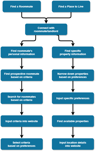
Now that we had a goal set in mind, we had to generate a goal tree that would dictate the broad steps necessary for every stage of the app, divided into either of the two categories: finding a place to live, and finding a roommate.
The Flow
The main flow of our design process was enabled by the interviews that we conducted and our subsequent findings. The results are presented below.
Interviews & Results
Before we could get started with any designs, we were tasked with researching potential users. What could they do with this app? How would they use this? What would they search on this?
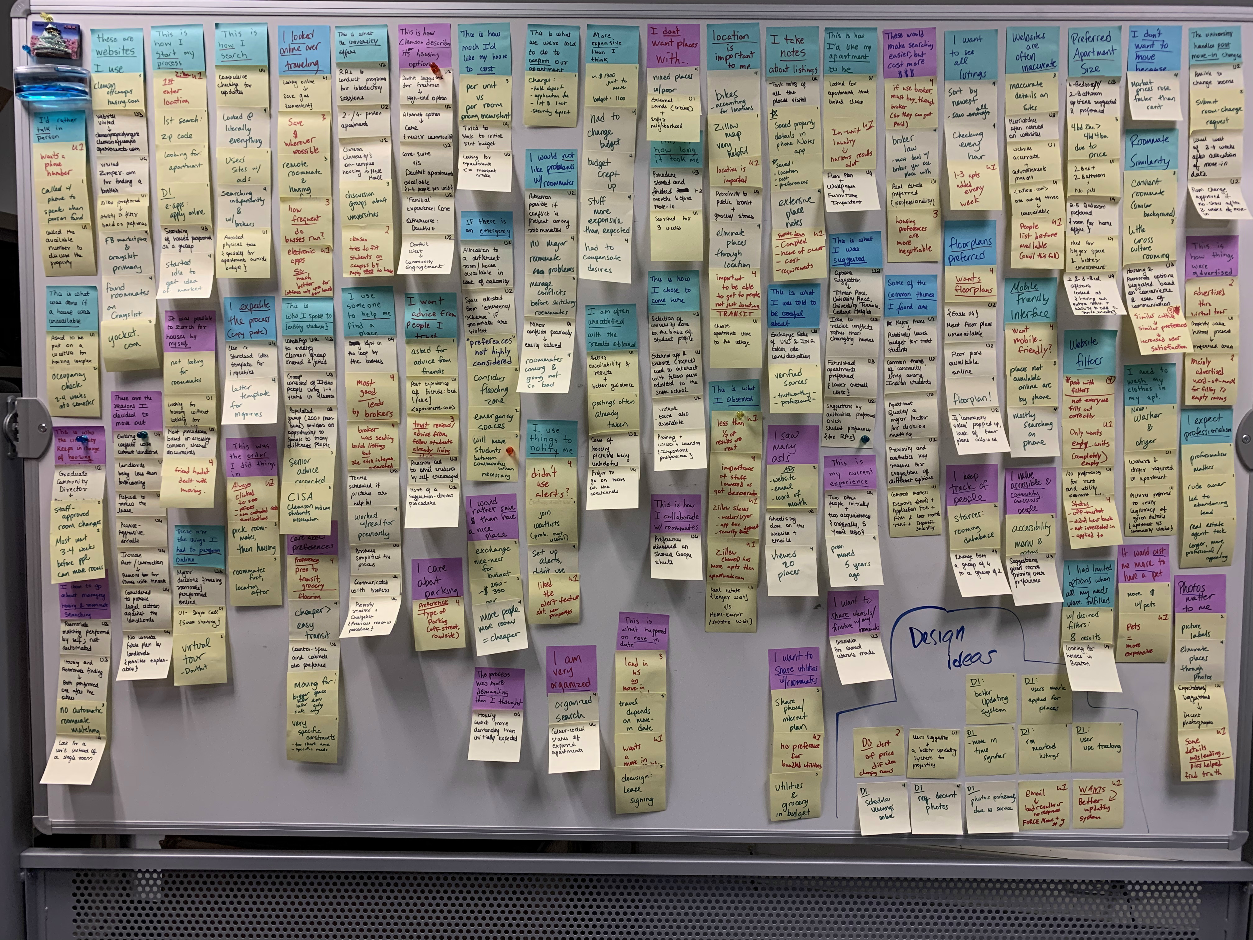
The first step was to reach out to people belonging to the target demographic. We conducted four interviews, following which we generated the Affinity Diagram. Five consolidated models were drawn from the compiled data of the four interviews: a Day-In-The-Life model, a Decision Point model, an Identity model, a Relationship model, and a Sequence model.
Did our focus change during the process?
Our primary foci, determined by the focus setting task, address ensuring accurate information and user satisfaction. These foci hold steady, but out interpretation of the task itself has changed from deriving solutions for multiple problems (finding roommates and housing) to investigating solutions for a single task (finding a place to live).
Did we find any surprising or unexpected results?
It was surprising to see that althrough looking for a place to live is sometimes not the most fun, and is met with a tight deadline and budget, people still put in a lot of effort to make sure certain preference criteria were met. Another surprising theme that we saw in all interviwees were the judgments on the pictures shown for the property.
Ideation, Personas & Storyboards
Following the results, we initiated our work on presenting a concrete consolidated vision, user personas, and storyboards, which would give us different scenarios of our product in use.
Ideation
Consolidated Vision
"All of a user's needs while searching for a place to live are met by our design."
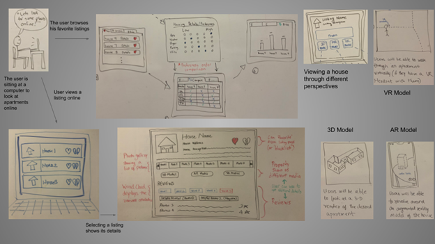
Product Concepts
As we continued working on the design, we convened on three key concepts which we opined would be critical for the optimal functioning of the product:
- Being able to access the app website via a computer or a mobile phone
- Providing a 'preference survey' while searching for a house
- Show housing options of a given location as selected by the user
Evaluation of each product concept
Evaluation of each product concept was done by analyzing how the product functioned and judging its performance based on the following six factors:
- Accomplishment
- Connection
- Identity
- Sensation
- Direct into action
- The learning delta
Personas
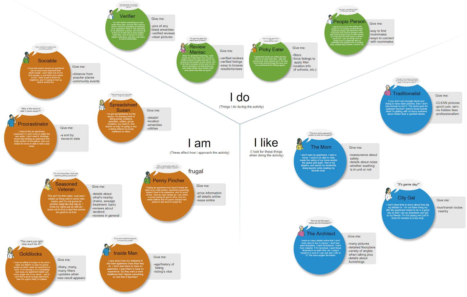
In order to understand how different types of users would interact with the system, we came up with four personas, each with different preferences, but ultimately one common objective. These four personas are:



Storyboards
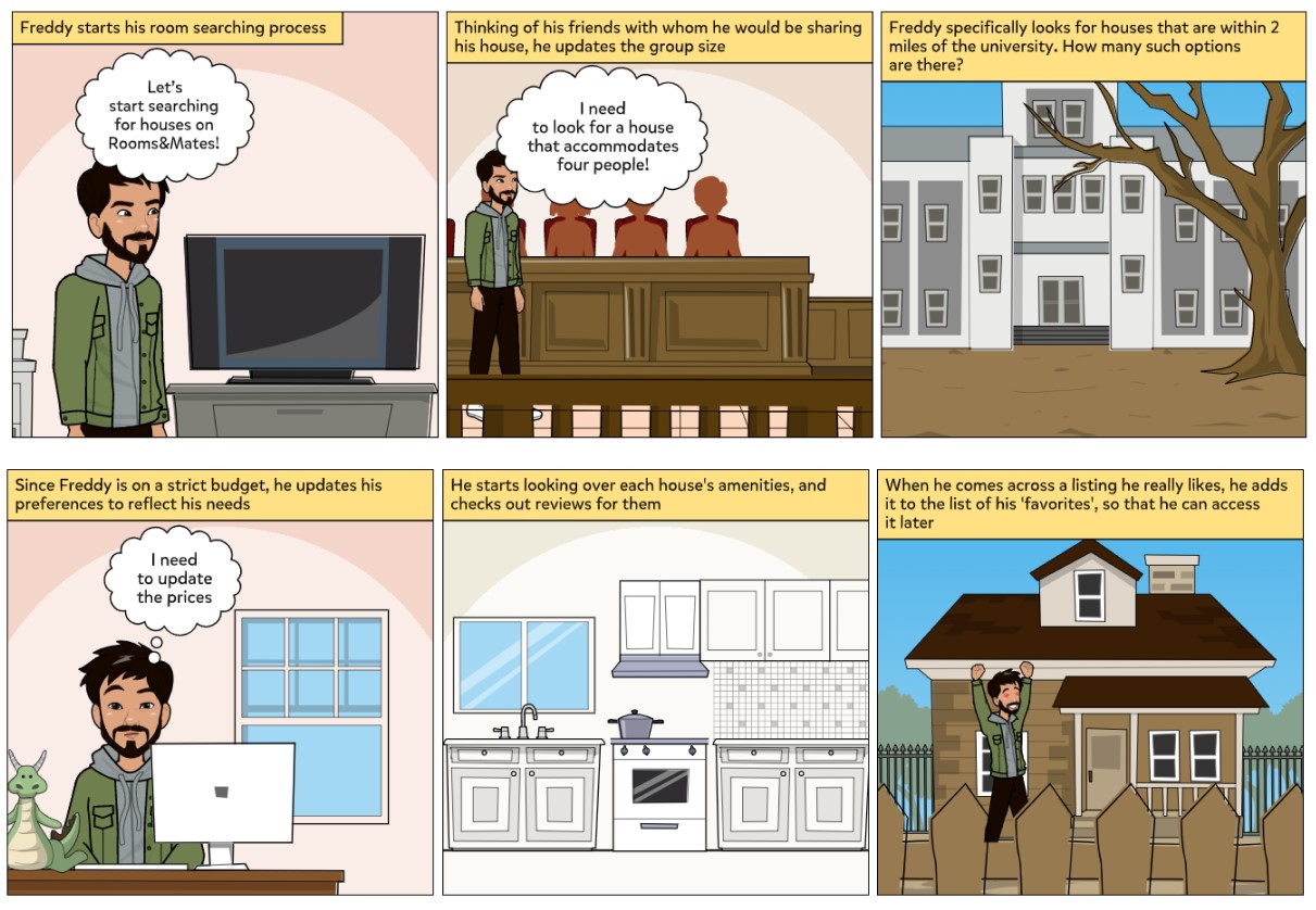
Storyboards are a great way of visualizing a scenario play out with a persona. It provides great insight into the typical environment a user might be in while using the product. A storyboard involving Frugal Freddy can be seen below:
Wireframes
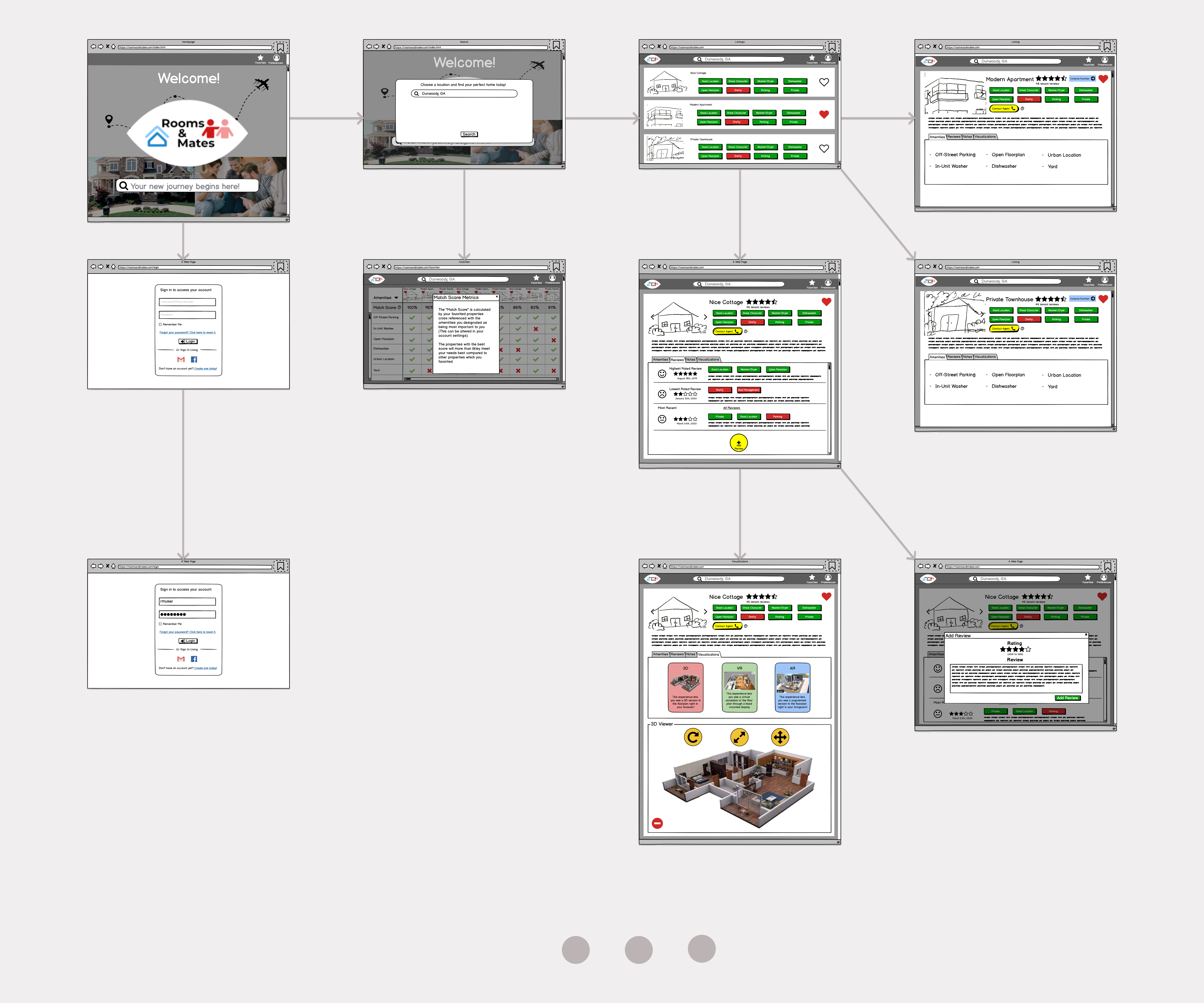
Finally, with all the information in mind, we developed a set of user interface designs to put the results of our research into context. For creating these wireframes for our application, we chose Balsamiq. Its low-fidelity design and simple yet intuitive user interface provides a wide range of standard UI frames for multiple different types of devices. Since it also supports multi-user live editing, it made for an ideal choice for collaboration among us. The visual below contains a subset of the 47 total wireframes designed.
