Swipe
Swipe is a concept for a website that serves as a central hub for events, communities, and groups online. It was created as part of Adobe's College + Twitch Jam held in March 2021. I participated in this competition with Jaitra Dixit, and we were tasked with developing a prototype that would provide the complete experience of using the platform.
Objective
Our objective, as stated in the Jam Brief, was to design a 'third-party desktop app or website that serves as a single-stop resource for any media related to a topic and encourages users to find new interests, events, and communities.' The first thing that came to mind was a website that would function similarly to how social media applications work; in such a case, content creation and community engagement would be important.
The Approach
Our approach mainly revolved around the inclusion of certain key elements that would help tie the whole product together. These revolved around collections, posts, pages, spotlights, and ambassadors.
With Swipe, we intended to provide a platform for two major concepts: content creation and community engagement. However, we wanted it to do so without having to definitively divide its user base into either of those two roles. Users who created content could garner followers who could interact with the content, provide feedback, and elicit further discussion.
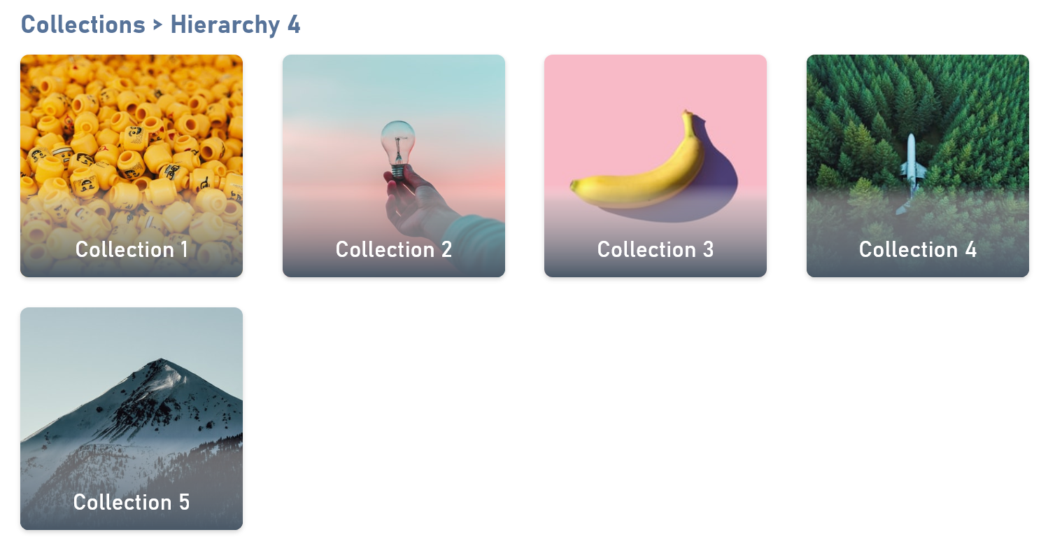
Collections
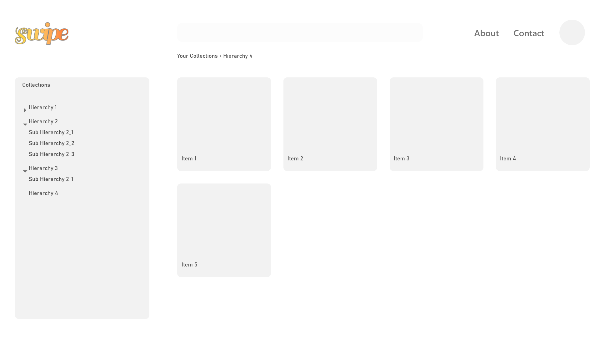
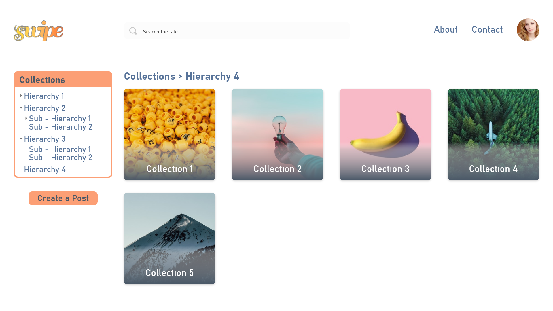
The next point to note is the notion of collections. We define this to be an accumulation of a person's interests, hobbies, and to-dos. Collections exist for everyone and can be both public as well as private. The former would be visible to other people who visit a user's page, whereas the latter would be hidden from everyone but the user themself. They could be toggled at any time as per the users' choice.
Collections can be thought of as an expanse where people can pen their notes but can also do so much more. People can create multiple collections, dividing them up however they see fit. Within each collection, they have the option of creating sub-collections and so on, providing a meaningful hierarchy that makes tracking and finding content easy. The content inside these collections can include different media formats, ranging from text to images and videos. With the push of a button, users can publish their content, creating a public post that other people can view and interact with.
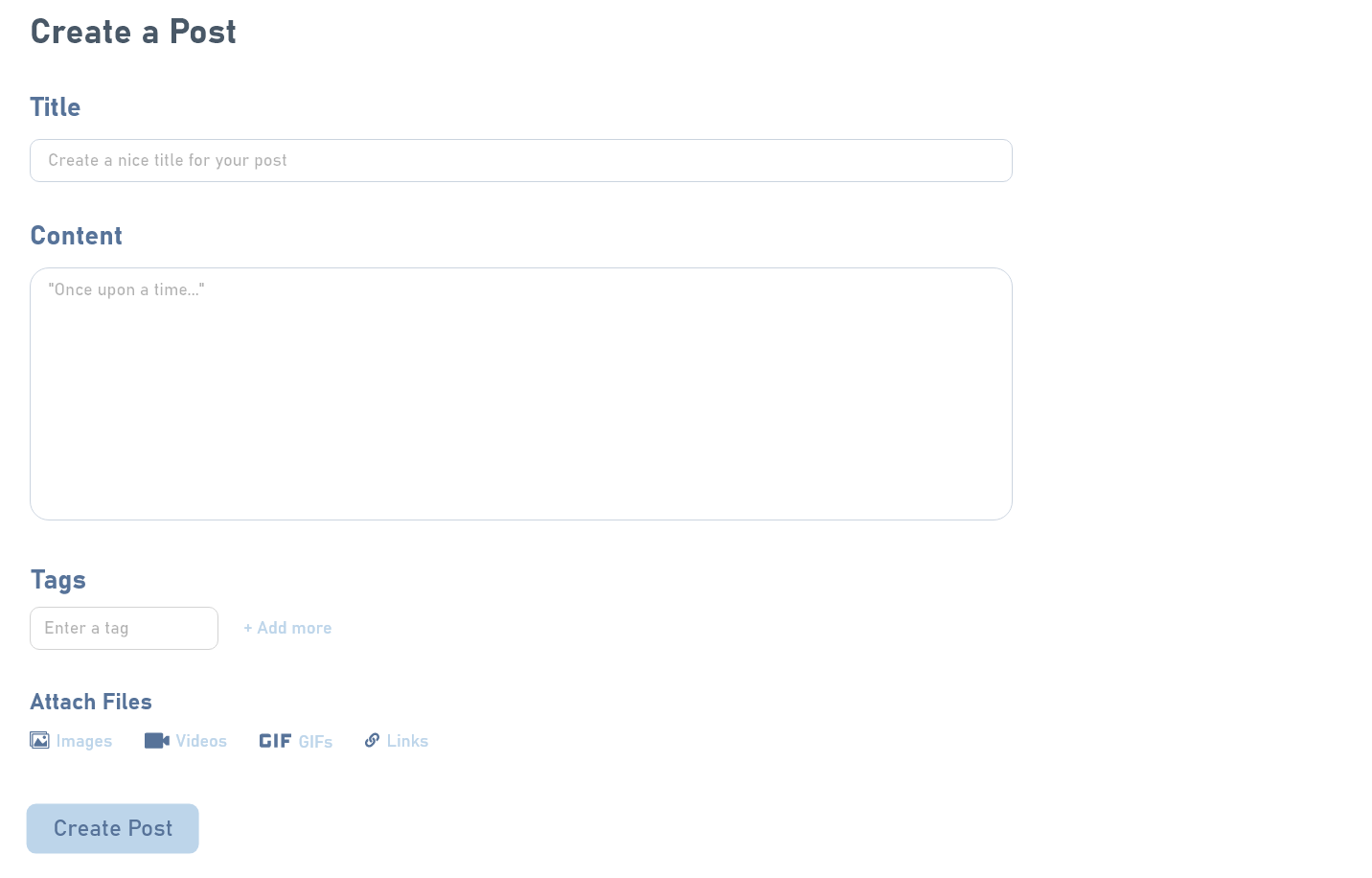
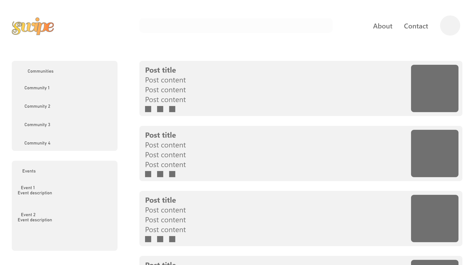
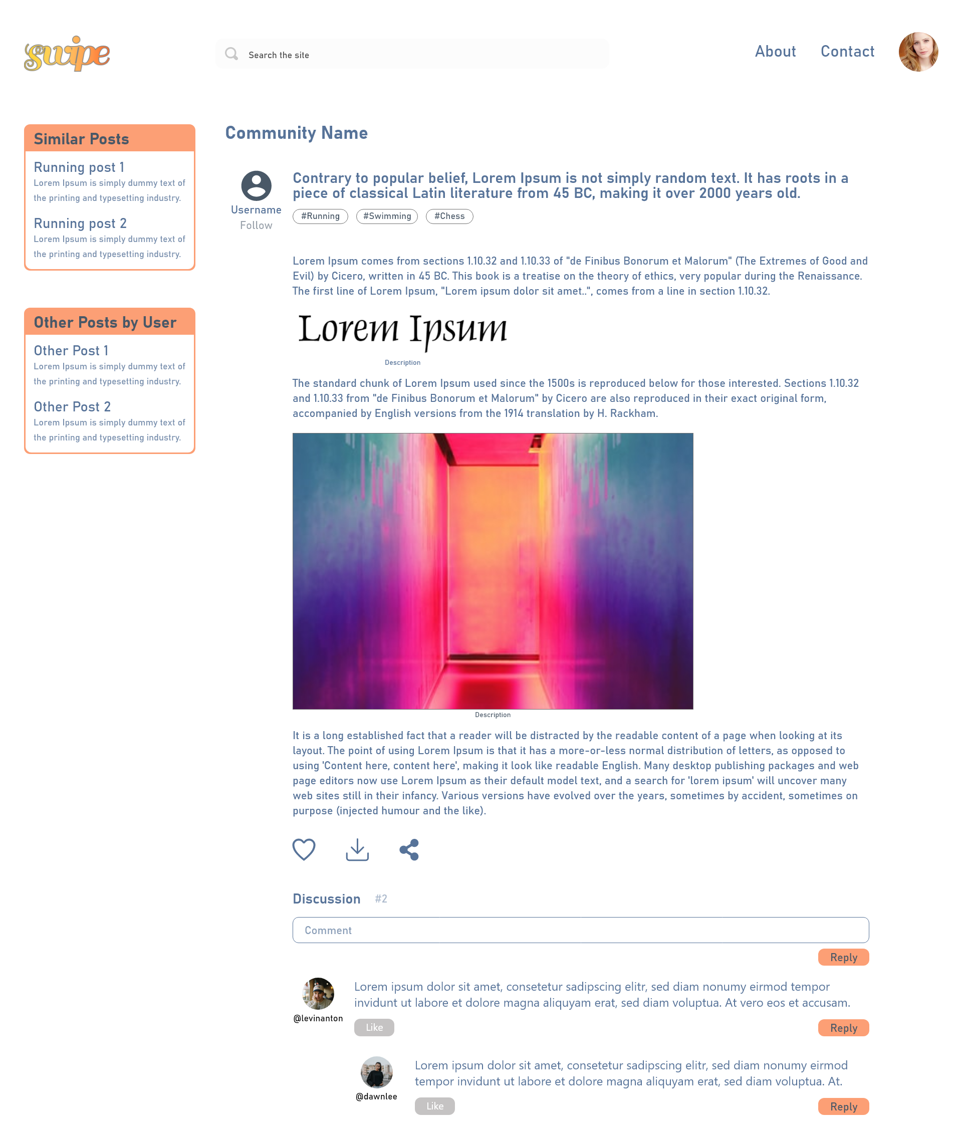
Posts
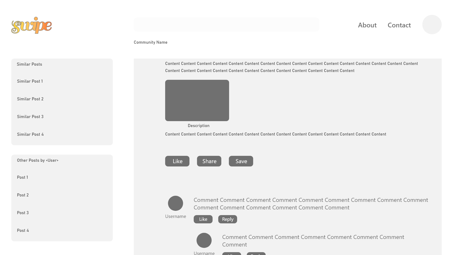
A user wishing to share their recipe for macarons can choose to make a post. This post can be as simple as a text recipe or a detailed write-up consisting of videos, images, and GIFs. Below every post, there would be a discussion section, where people can offer comments, rate the creator's post, and save it so that it is visible in their collections.
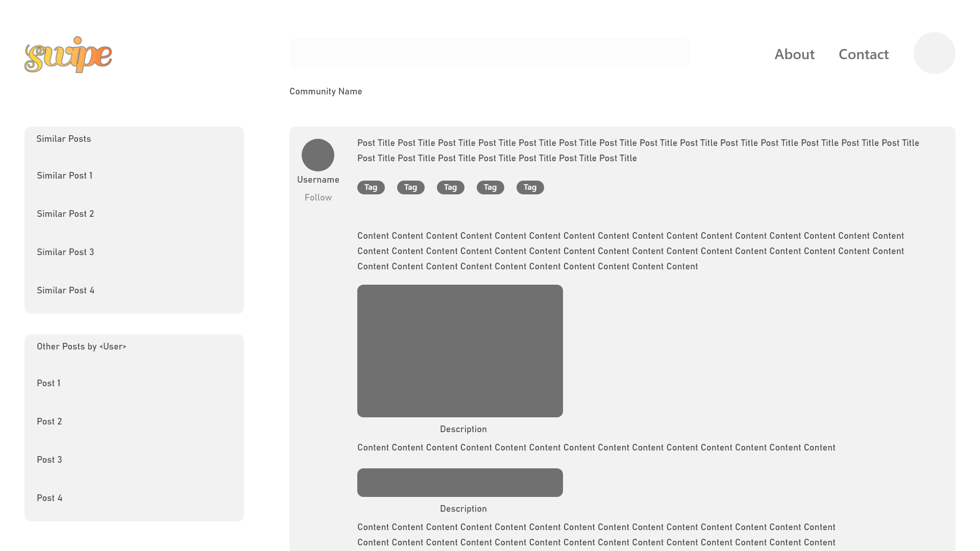
Pages
In addition to a discussion/comment section being available for every post, there could be a discussion section present on every user's personal profile. Additionally, this page would summarize what the user has posted, and any community engagement instances they might be a part of.
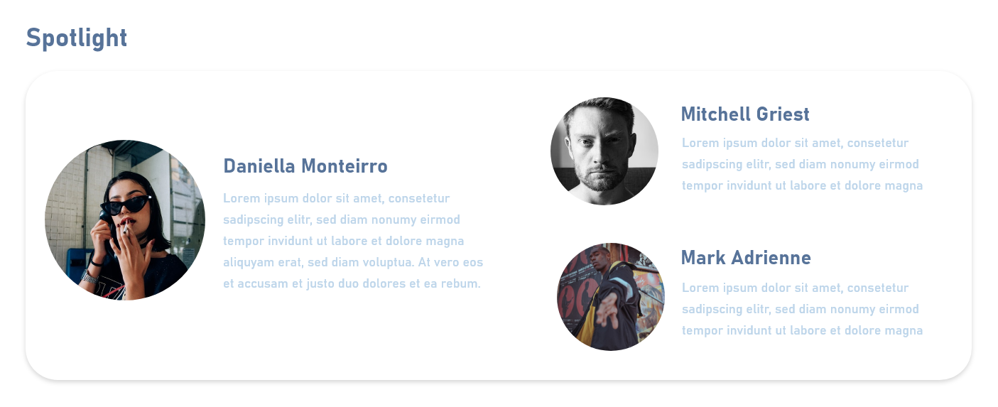
Spotlight & Ambassadors
Each month, the product would have a spotlight over a particular topic, where notable creations and posts will be discussed. Spotlights will have associated with them a series of ambassadors, who have been voted by the public to provide a voice on the chosen topic and spread awareness.
Research
As part of the UX lifecycle, we conducted interviews to find people's opinions on the existing websites that provide a platform for content creation. We then analyzed popular social media and blogs. At this point, we wanted to ask ourselves essential questions: what makes them work? How does it work? How do they implement these features together?
We wanted to make a website that provided the reach that social media websites provide, but without explicitly making it a social media. Social media websites are vast in their applicability. While its reach is undeniable, there are a lot of factors that contribute to its efficient functioning. Allowing ourselves to not rely on a typical social media-esque design format, allowed us some creative freedom to explore how we could bring together our concepts.
As part of our analysis, we found common services among these popular websites. We then compiled our research and interview findings using sticky notes via Miro. Since we had a limited amount of time to finish the product (plus a team of only two members), we decided to progress with the two interviews and their subsequent findings.
Sketches & Wireframes
We initially designed low-fidelity sketches to integrate our ideas and our findings. Then, we iteratively improved the design elements of our low-fidelity sketches before designing fully realized high-fidelity designs.
The Prototype
The competition required us to use Adobe XD to devise a prototype for our desired system. As such, we designed high-fidelity wireframes using XD first. This was done in order to assess the visual 'viability' of our low-fidelity designs and to improve upon them using actual design elements. Using key design principles such as color theory, typography, and hierarchy was essential; the product was designed to be useful as well as visually and aesthetically appealing.
After the high-fidelity wireframes were made, we connected the necessary screens to form a prototype with a proper flow.

VCFZS
Rooms&Mates